Japanese: Here.
Hi Community,
We wanted to share a bit more on the strategy behind the purple color that was used for Symbol’s visual identity. We understand that color is subjective and emotional and we want to bring more transparency into why this color is the right strategic choice for the brand.
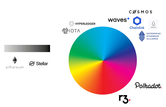
The Catapult Brand Steering Committee commissioned the Better Way Brand Agency to do extensive market research and one important part of this audit was how color is being used by competitors in this space.
Some key findings from the competitor creative audit showed that the color blue was the most predominant color used by competitors in this space which leads to a less memorable visual differentiation with brands that use that color. This is another area where we needed to ensure Symbol stood out.
We also personally saw the majority of booths at the San Francisco Blockchain held a few months back were mostly the boring “blockchain blue”. PHOTOS HERE
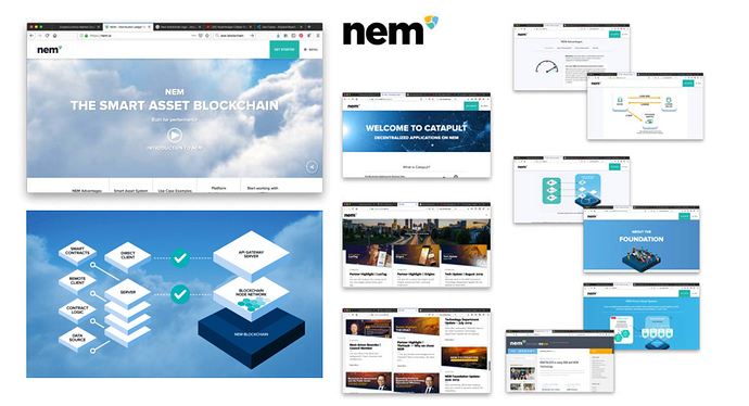
Currently the NEM identity has perhaps the least cohesion in comparison to the competition: held loosely together by the three colors (although these aren’t always consistent), there is a mix of illustration, icon and imagery styles – although it is clean it lacks a clear direction or personality.
Graphic backgrounds are another familiar and well-worn trope, particularly ‘the network’ dots and lines style image (above). While they help the brands stand into the category, they are generic and non-differentiating so this is another area we wanted to differentiate.
That led us down the path of identifying a color scheme that we could “own” and be a strong visual cue that Symbol was a brand to pay attention to and not fade in the basic sea of “blockchain blue” that so many other brands seemed to embrace.
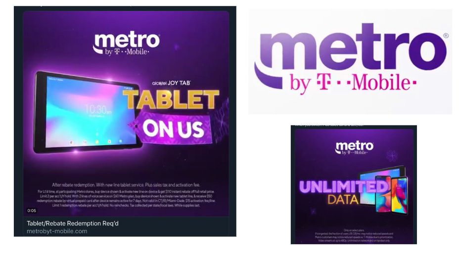
The color purple was a clear choice for us. It’s interesting because other multi-billion dollar non-blockchain technology brands also recognize the power of the color purple. T-Mobile is one of those brands. They’ve strategically built the brand identity around the color magenta and even trademarked the color.
T-Mobile stated that they chose the color magenta to be linked in people’s minds and this has been a successful strategy that has proven to help them stand out and keep ahead in a competitive environment.
Also note the brand hierachy of “By T-Mobile” to launch another new product in their family line of products (just as we are doing with NEM, mijin and Symbol.)
Last year the NEM Foundation brought in brand expert, Alina Wheeler, the author behind the book, Designing Brand Identity, to Consensus to give us her expert thoughts on how NEM compared to the rest of the industry and how we could strive to differentiate.
Alina Wheeler says, “Choosing colors requires a core understanding of color theory, a clear vision of how the brand needs to be perceived and differentiated, and an ability to master coherence and meaning over a broad range of media.”
So that’s one of the reasons we hired an agency to help us with Catapult.
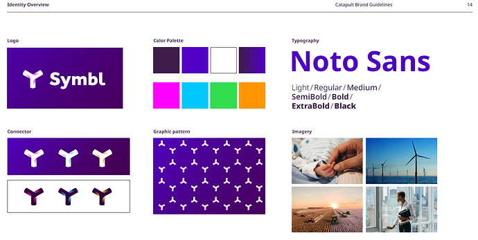
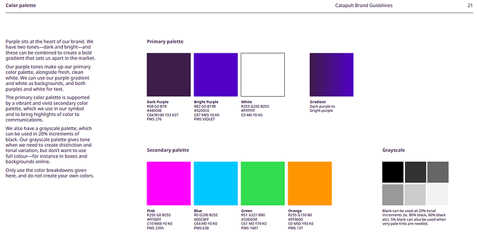
Here’s a sneak peek of the work in progress from the Better Way Brand Agency for the brand guidelines for Symbol.
We hope this can help demystify why it was a strategic and competitive choice to go with the color purple as part of Symbol’s identity.
Let us know if you have any additional questions!
Alex

