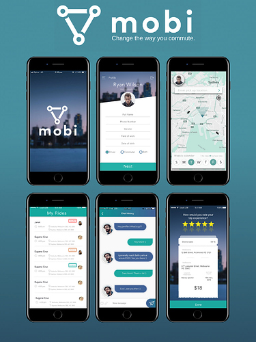
Mobi screens and design

Hey guys!

We’d like to share some of our latest designs of Mobi.

What do you all think?

The screen are as follows (starting at top left):

  1. Opening screen
  2. Sign up page where details are added
  3. Home screen where route is inputted)
  4. My rides tab where upcoming and current rides are managed
  5. Chat screen
  6. Rating screen

Join our Telegram and let us know what you think! https://t.me/mobionnem

Thanks,
Anthony

4 Likes

We’re really excited about introducing Mobi to the NEM community!

Follow us on Telegram if you would like to find out more: https://t.me/mobionnem

Feel free to ask any questions or follow up with some feedback.

Dan

2 Likes

Without a doubt, a gorgeous representation of modern design aesthetics! 10 of 10.

2 Likes

Thanks @Charlie_Muir!

We’re working hard to make sure we deliver the best product we can for the commute market!

1 Like