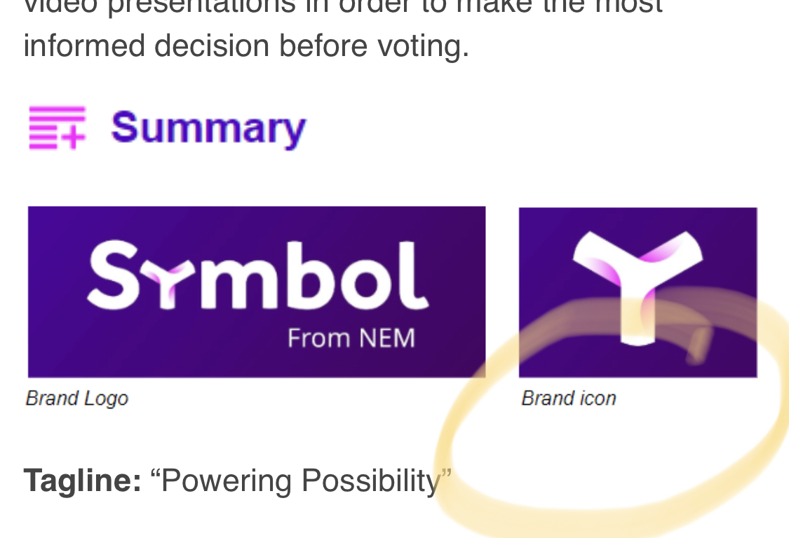
We say Symbol’s “icon”… not Symbol Symbol.
3 Likes
Individuals or businesses want (and should) register their trademark to protect their intellectual property. However, the United States Patent and Trademark Office (USPTO) views the primary purpose of trademark law as preventing customer confusion among product or service offerings.
2 Likes
Foundation arranged for NEM Holdings to own it and Foundation paid for trademarks and brand agency/legal to secure all trademarks.
4 Likes
Yes, we need a trademark. Especially as we build out more global supporting products for the platform and explore new sources of revenue (example = licensing).
3 Likes
Who is “We”?
Foundation arranged for NEM Holdings to own it and Foundation paid for trademarks and brand agency/legal to secure all trademarks.
2 Likes
I understand. Thank you
2 Likes
Thank you 
2 Likes
 This may help too.
3 Likes
On request of devs, I invented the name “Catapult” for our community and over the years I have really loved it.
But I like model 1 more. It allows for more “NEM” products in the future.
I think “Catapult” can stay a reference to the engine and technology but Symbol be the brand that holds the Catapult engine.
I like the engine for NEM1 being NIS1 and the engine for Symbol being Catapult. But they all are still “From NEM”.
7 Likes
I wasnt sure what to think at first, but grew on me pretty fast, dropping the “O” from symbol actually makes it look even more appealing and transforms a common word into something completley new and distinguishable.
What comes to my mind with the word symbol is anything to do with cryptography, hence security, and a certain amount of mystery too. Then think of the Rosetta stone, Egyptian hieroglyphs etc, all are “symbols” that have significant meaning but needed the “key” aka Rosetta stone to decipher them.
Much more comes to mind too, but thats my 2 cents.
3 Likes
It does stand out without the “O”. I like both spellings though. Curious to hear more on this from others. I put a poll up on Twitter on this too.  https://twitter.com/Inside_NEM/status/1208191808032915457
 https://twitter.com/Inside_NEM/status/1208191808032915457
3 Likes
Even-though its a design placement…I wish we can and do a SYMBOL CON like Google IO 
1 Like
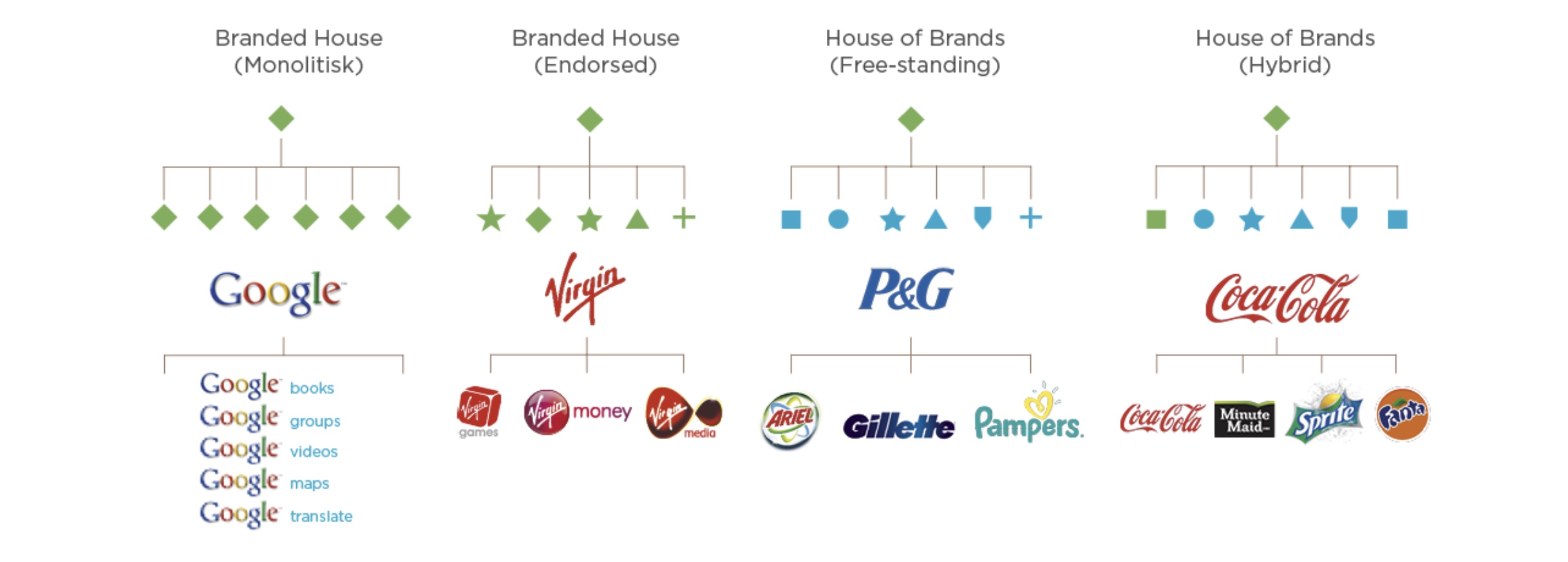
Great question. Having a house of brands would be a powerful next step and open the door for even more products to evolve our ecosystem cohesively. I am proud of NEM and would like to see option 1 become a reality.
Until now, everyone was free to use the NEM logo.
If the name “Symbol” and the “Y” logo were passed as a new brand, would anyone be free to use this name and logo for any purpose, including commercial use?
1 Like
thank you for answering.
How the public perceives the new brand of catapult is uncertain at this time.
However, it is still possible to clarify your branding policy.
Just in case, let me check.
Is your goal as a branding team correct in (1)?
Please tell us about “policy”, not “hope”.
2 Likes
I absolutely love the fact that you threw out absolutely everything (this is not sarcastic, all that stuff needed to die) but I gotta say, as much as I like the logo, I absolutely hate the name.
I haven’t gone through all the discovery documents, but I figured first impressions are important so that’s what I wanted to provide here.
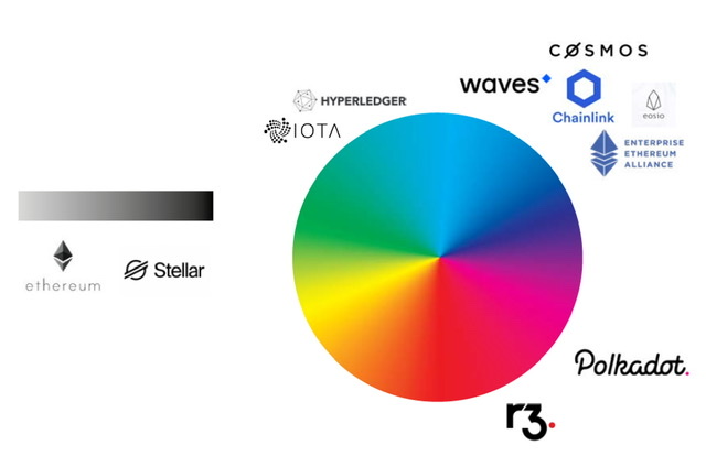
The name says absolutely nothing about anything, at least at first glance. It’s meaningless and honestly, it’s not even cool or special. A lot of companies pick names that aren’t gonna mean a whole lot to most people (and crypto projects do that most of the time really), but those names are usually intriguing or just sound awesome. IOTA, Ethereum, Stellar and even r3, all those are catchy and sound really nice. Symbl is, in my view, neither. It’s bland and I couldn’t care less about what’s behind it. As a business, this wouldn’t affect my decision making, at least not consciously, but evidently branding is important and so is the name.
Likely, this name will grow on me, but if we’re gonna spend a lot of money on branding, it shouldn’t have to grow on me.
I will likely not vote. I don’t want this project to get stuck on the brand, but I can’t vote in favor this either. It’s just meh.
I’m not wild about the focus on enterprise but I know that’s not a popular opinion around here and I get why this direction was chosen. It’s a difference in philosophy and that’s fine.
/edit:
I think you should stick with Symbol. With autocorrect (both the tech one and the one humans inherently have in their brain) I think Symbl mit just cause confusion when looking up the project.
Been through all the material now. Still of the same opinion. In fact, now that I know the meaning behind it, I like it even less. I thought this was more than just asset digitization ?
2 Likes
i think the rework of shu is the best so far:
1 Like
My understanding was that the policy of the branding team was to eliminate the word “NEM”.
The reason was a coincheck hack.
Are they inconsistent?
The expression “from NEM” is not consistent with branding.
I like “powered by Catapult”.