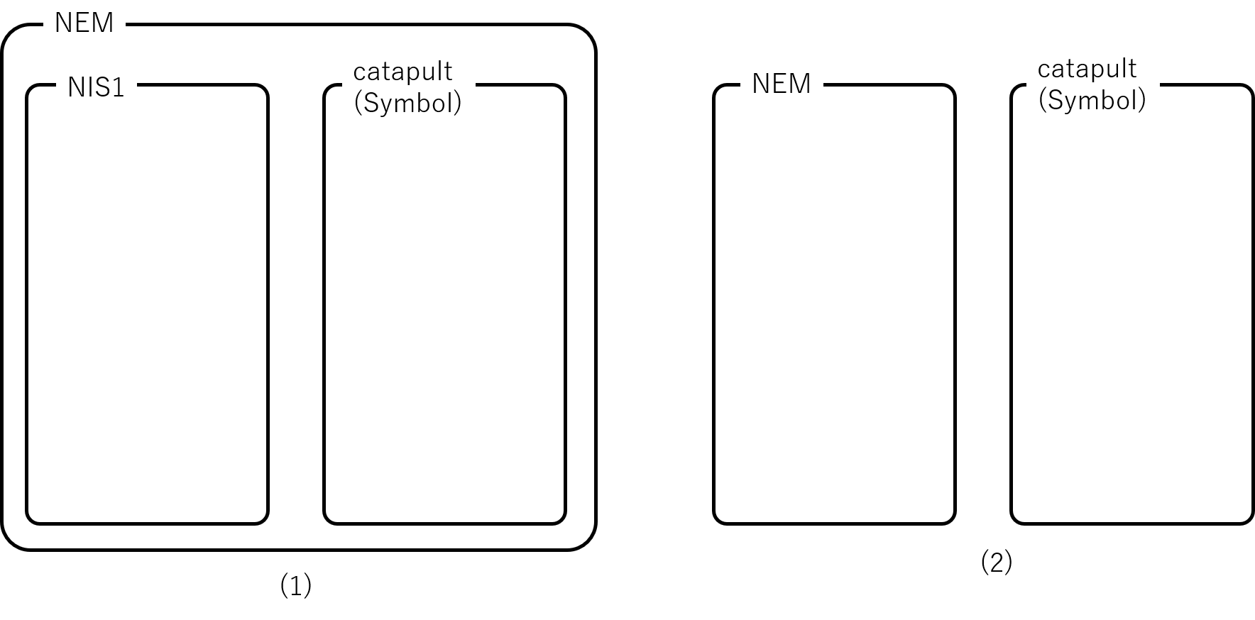
What do your suggestions mean (1) or (2)?
2 Likes
Symbol hmm 
It’s not bad but I’m not wild of it either. I hope it will grow on me…
Anyway, does anyone remember this ? 

I must say I do like the new logo.
10 Likes
the design of the two projects is currently too different. i think at first glance, nobody recognizes a connection. I would have liked a little more corporate identity. It is very generic.
1 Like
Hello? Somebody Please tell me
I would like to know a little more about why you couldn’t use catapult.
and In Japan, Symbol is registered as a trademark.
1 Like
In the video when we can see how the new logo is born, the 3 circles and the degrees tilt is exactly the same as ripple logo (I can make a screenshot and put them on the same photo if you dont believe me)
So we spent hundred of thousands of dollars and hours to get the same idea as ripple ?
- The name, I’m not that fan (A simple “NEM” was good)
I assume that’s being done on purpose in order to break away from the past ( while still referring to it ) .
3 Likes
Yes. I have already made this observation. In my opinion, only one of the two can succeed. i am sure that as a community we have shown that we are attached to our history. And we see Nem as a roof. For me, this means that every subsequent design must be based on it. But the advertising agency actually advises you on such steps and offers various models.
You might notice when your child grows up. He or she is different from you, is faster, certainly has more new knowledge, but you still have enough good ideas to change the world.

The only thing you need is the right support.
2 Likes
I am sorry, but i dont get the Point.
With the right conditions, NIS1 has a good chance of being successful.
1 Like
Agree
CATAPULT = ALREADY TRADEMARKED = NO
SYMBOL = FOUNDATION GOT THE TRADEMARK - YES
JAPAN ≠ NOT WORLD. WE NEED A GLOBAL ADDRESS
I don’t know if I can explain better. Hope you got it.
Poor reason
Or maybe they paid 100K for branding  Make sense?
Yes. I wrote an article about this very thing here: Brand Update #7: The Color Scheme and Strategy Behind Symbol
2 Likes
We own the trademark for Symbol and also Symbl in Japan.
Catapult had 44 conflicts around trademarks in tech so it was not possible for us to use that name.
3 Likes
Can you share more why you think this? Extensive research was done looking at top brands in tech and blockchain. This was strategically crafted to be competitive and resonate with enterprise and enterprise leaders were interviewed on the brand. Not sure I understand the “generic” feedback.
3 Likes
I actually pulled this image up during a brand meeting. I shared feedback on old logo variations (after talking with Mixmaster, Brain, Makoto and Jeff) and the Brand Steering Committee looked at various ways to honor the community in the logo. We ultimately chose the Fibonacci method as a nod to the past while looking toward the future. There were other logos and hundreds of names explored. We liked this one best and could own the trademarks.
3 Likes
I disagree. The visual competitor audit the agency shared shows NEM’s color scheme is not as competitive in this space. Brand Update #7: The Color Scheme and Strategy Behind Symbol
3 Likes
Brand Update #7: The Color Scheme and Strategy Behind Symbol The current NEM color scheme did not rank high in the competitor audit and the decision to have new color identity was to have an edge when it comes to visual identity and memory recall.
3 Likes