NEM on Coinlib - Feedback Welcome

Hi to all,

My teammates and I spent several months to create Coinlib
I wanted to share the page of NEM with the community and ask for your feedback. A few of the things you can do on Coinlib:

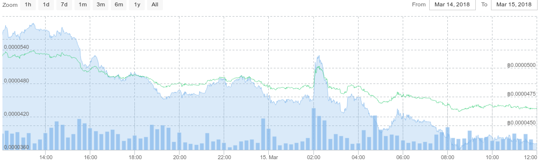
  • Track NEM’s price in real-time and historic data
  • Set up your Portfolio, add trades (or auto-sync from exchanges)
  • Get price alerts
  • Track news about NEM and see basic info about it

There are no fees, subscriptions and you can use the site (except for some features) without registering.
Of course you can track other cryptos, too.

I wanted to ask for your feedback and to also check if any info on NEM’s page needs updates.

1 Like

Well… the price of XEM in Coinlib appears to be 455sats when in exchanges its around 4550sats? No wait! You display price in seven decimals… sorry! :slight_smile: Let users amount of decimals they want use for price? Would be really nice to have BTC moved closer to top (favorite?) for price selection box.

Apparently there is smallish bug on price graph, I did something following: chose XEM to display, selected BTC as base currency, then price from Bittrex, then ticked avg. price of, then clicked avg. price on and bittrex of and now I have two graphs for price (it says it is same price but there are two distinct graphs, one lower/higher than other).

“Description” field (on currency page) link “Show more[+]” is broken, it just loads URL “javascript:$(’.toggle-desc-145’).toggle();”

I assume that you are going to put more features on graph along the way? (volume display for mouse hover, etc)

1 Like

Hi there.

Thanks for the feedback.
Regarding the price, we only present you the price based on the base currency you chose. In your case if you chose BTC you will only see the price calculated directly via BTC-NEM trades (no other trading currencies will affect the price you’ll see).

Re on the graphs, if you chose Bittrex and the avg. price you’ll see 2 graphs. One is for the Bittrex and the other one is for the average from all exchanges. The prices should be close hence you see one graph slightly above the other.

Can you please send us a screenshot about the 'Show more+" bug you see? Also which browser and device you’re using. You can also send us a shot of the graphs for us to better understand what you see.

Hover features do exist now. Try hovering along the graph, you should see volumes when the vertical line reaches the bars that start from the bottom of the graph (indicating volume).

Show more screenshot and graph screenshot below. Show more might be something to do about my FF browser (58.0.2 64bit, showmore functions properly on Opera I have on my computer. I’ll look into this more (I have tweaked my settings).

You should be able to reproduce the graph “bug” (two graphs) by doing following:

  1. Choose currency
  2. Select exchange for currency (e.g. Bittrex)
  3. De-select average price
  4. De-select bittrex
    Coinlib automatically selects average price graph when nothing is selected, but for some reason graph gets two graphs in it.

Heh, yes, I noticed that I need to hover my mouse on top of volume bar in order to find out volume. Well, my bad then! (I assumed that volume would be displayed along with the price box automatically)

coinlib_showmore

Thanks for the great feedback.

You seem to be right on all points you mentioned, they help us improve.
We’ve now changed the behavior to show 8 decimals when needed (if you select BTC as the base for example).

We’re fixing the show more JS error on FF.

Regarding the select/deselect exchanges, we reproduced and put a note to fix it. We’ll also be optimizing the volume behavior, so you don’t have to search and find it but rather have it easily presented.

I have to admit those are some suggestions coming from a meticulous user, so thanks for taking the time to use the site in detail and provide your feedback.

I hope you enjoy it in overall.

2 Likes